Wakefield A.F.C. required a modern brand identity to act as a catalyst for their push towards becoming a Football League team for the first time in their history. I created something which embodies the rich sporting and mining heritage of the area, but also a logo that could be adapted and co-opted by the fans of the club.
The two main aspects of the logo are made visible, the white rose of Yorkshire and the five petals representing the five towns of Wakefield. The crossed mining pickaxes in the background elude to the traditions of the area. A set of brand guidelines was also produced for internal use within the club.
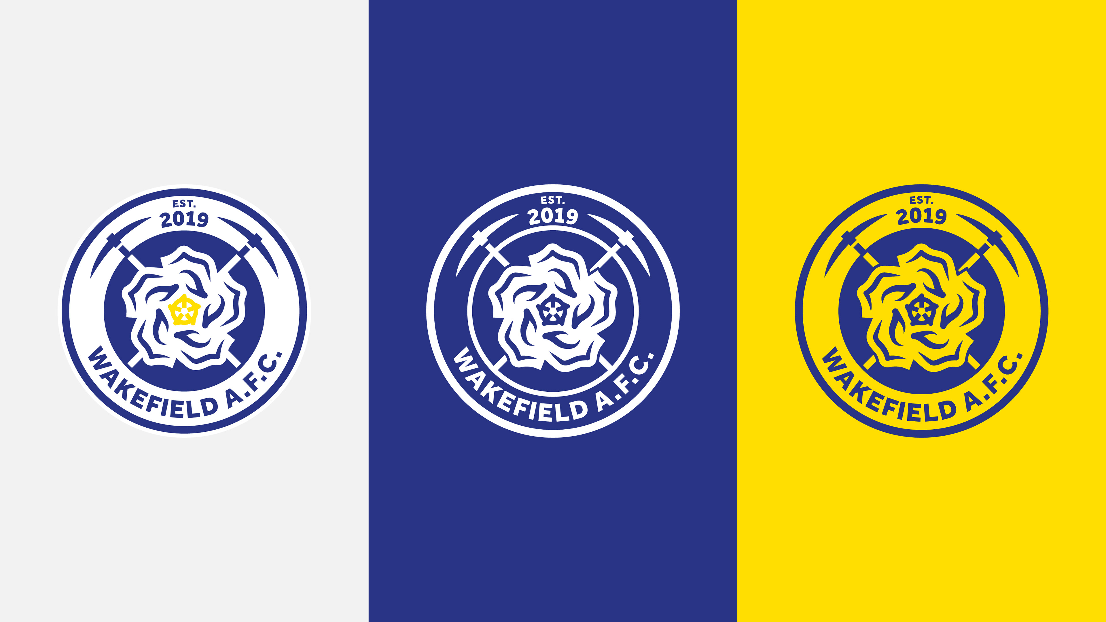
Showing how the main logo (far left) can be adapted for different coloured backgrounds. The main idea is that the rose remains in a brighter colour/white
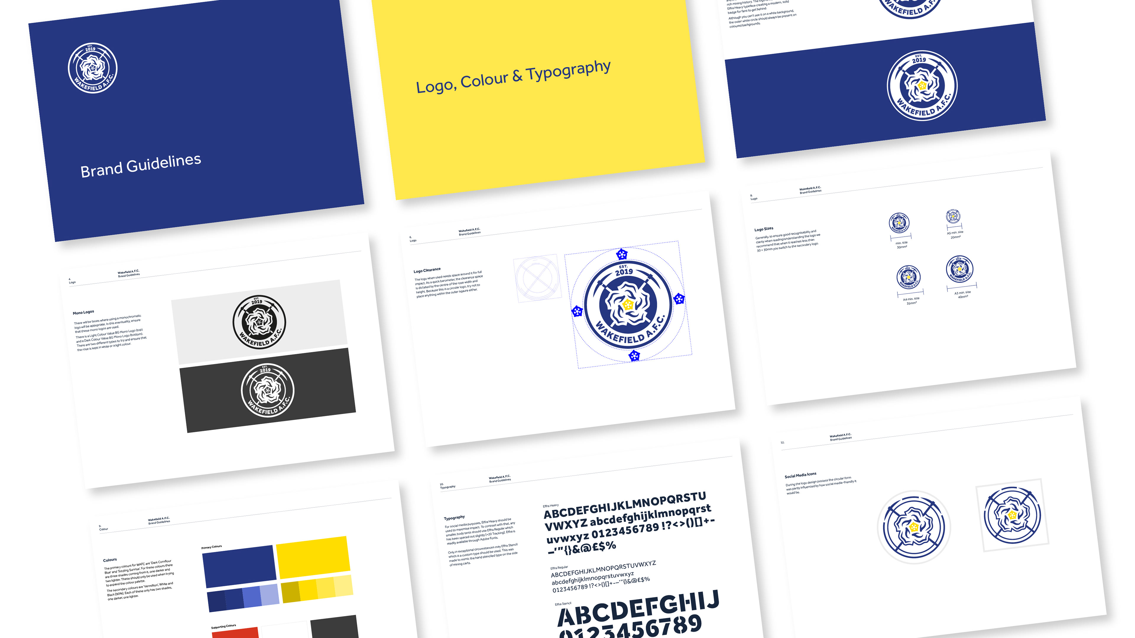
Brand guidelines sent to the club so they understand how to properly use the identity

Logo in use on the 21-22 Goalkeeper kit

Promotional billboard shown at Trinity Walk shopping centre, Wakefield
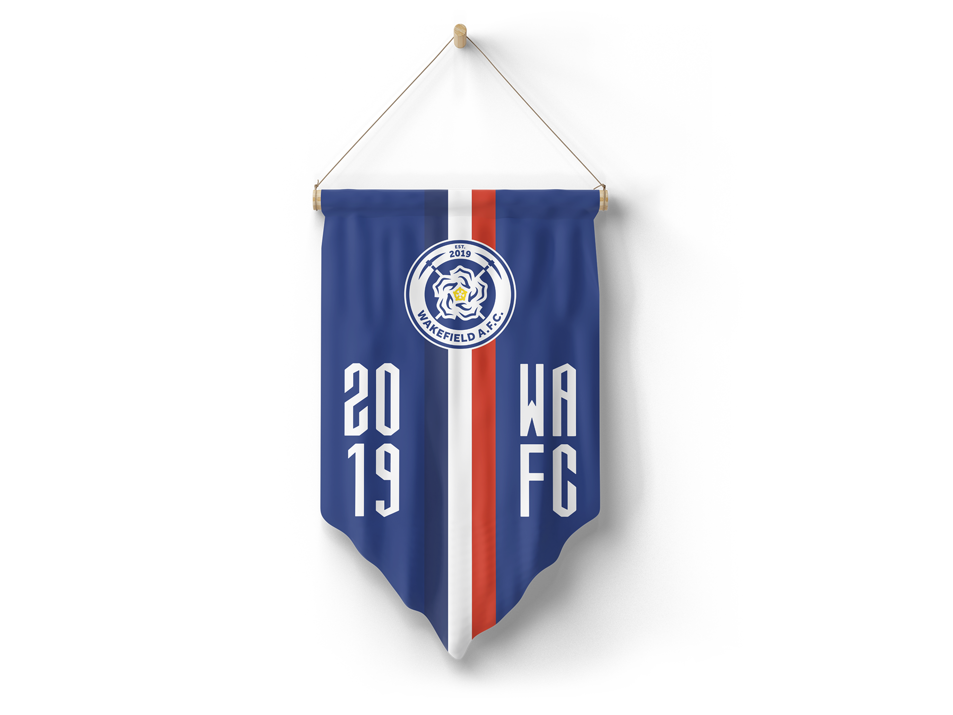
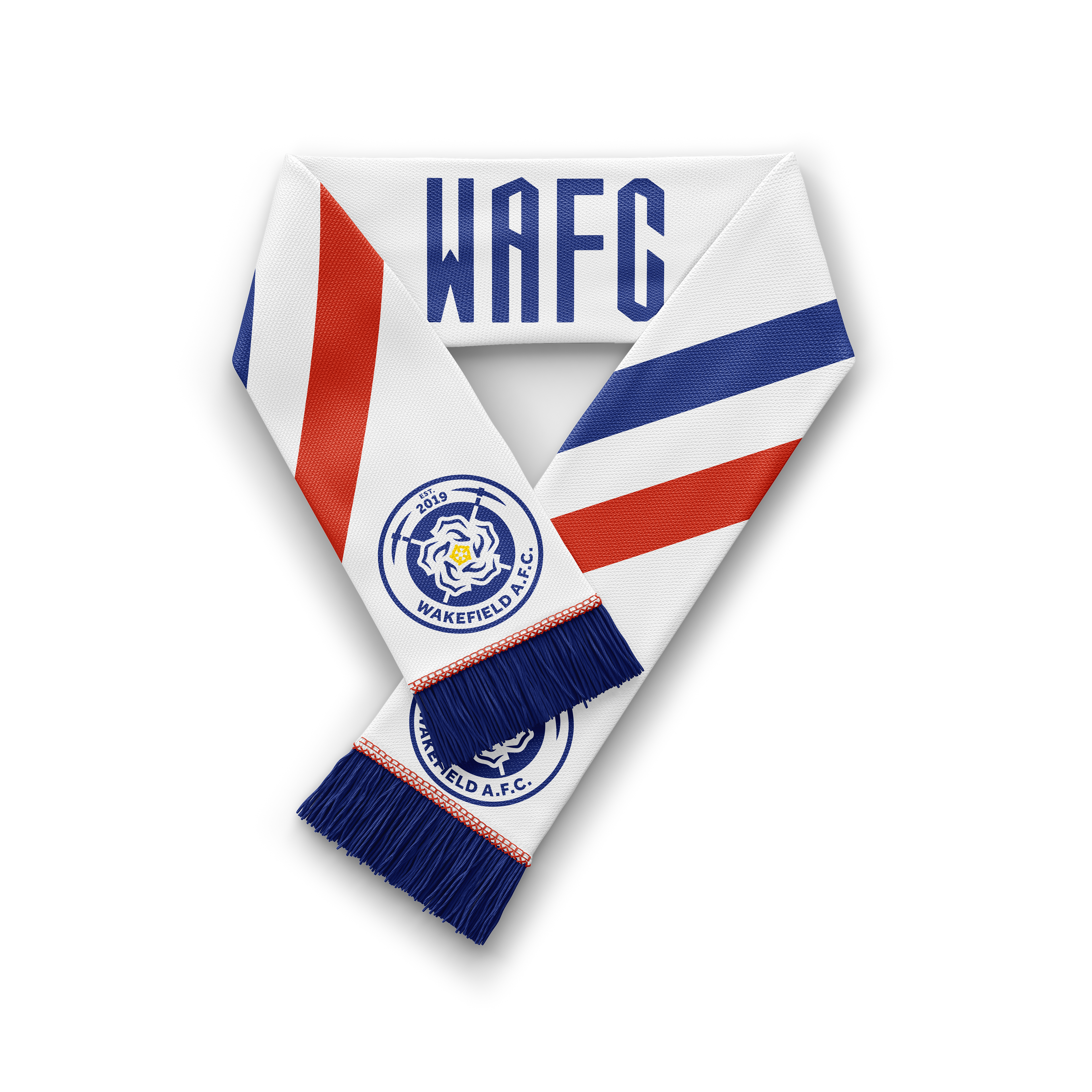
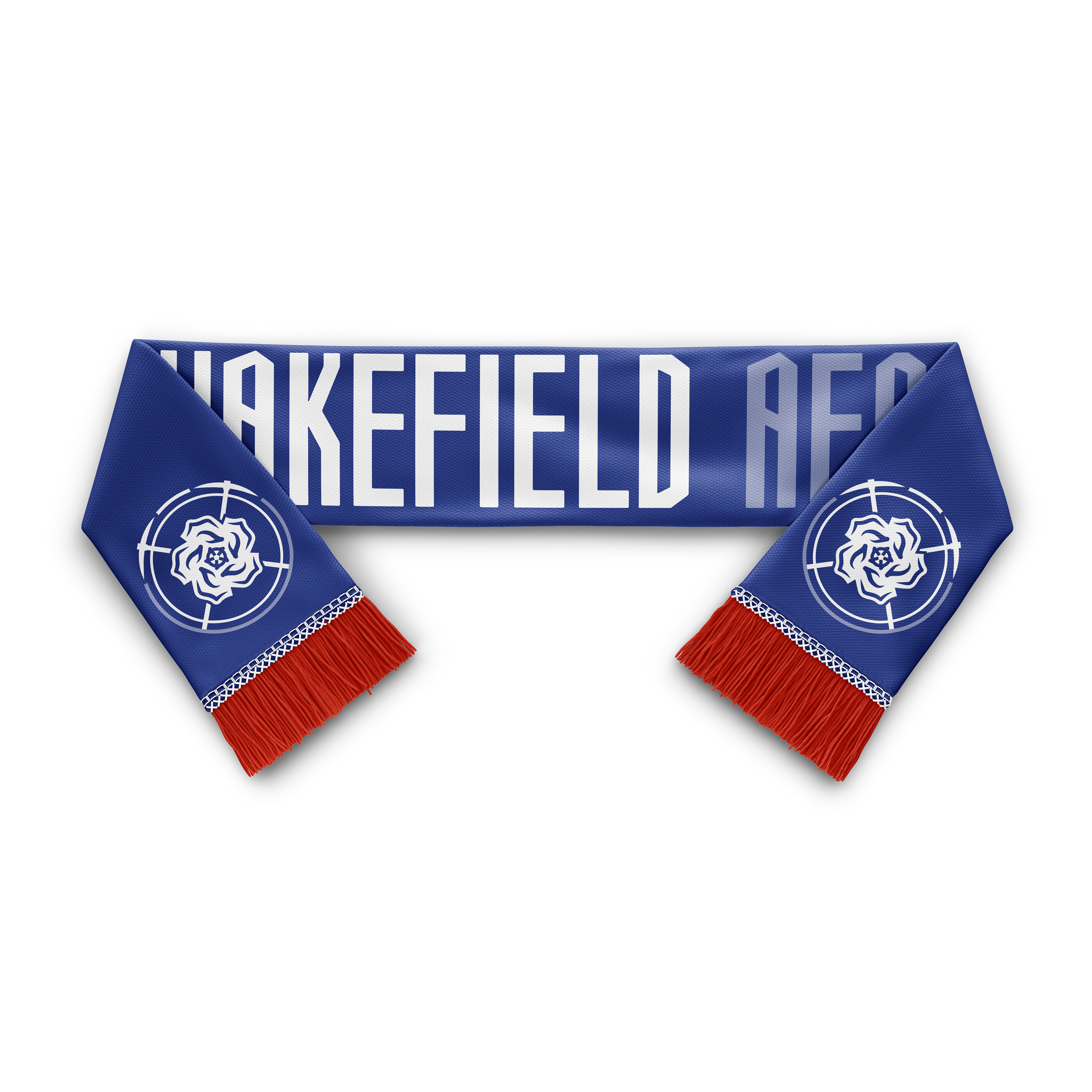
Various Wakefield A.F.C. promotional items - scarves and pennants
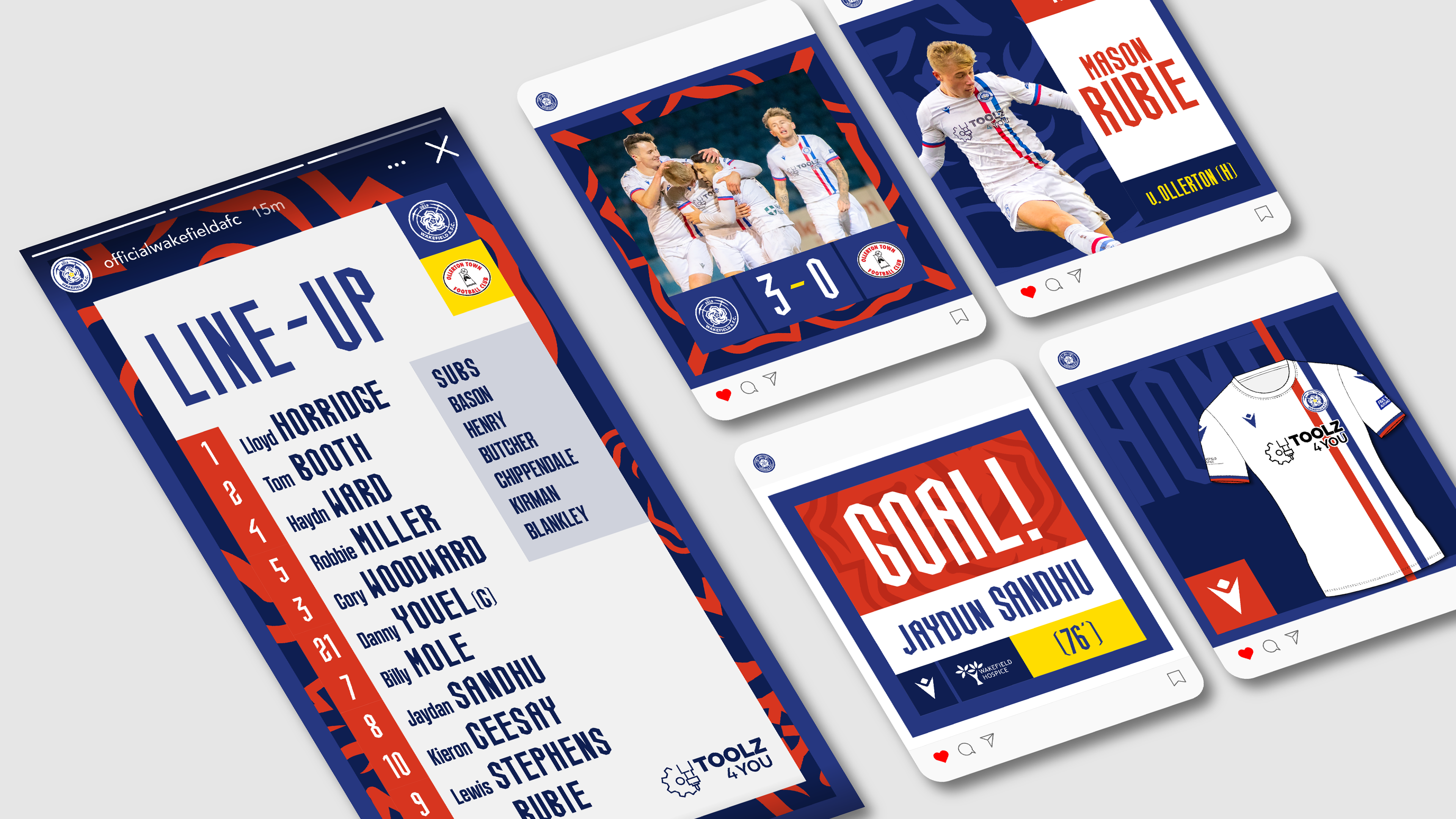
Example of the brand being used over social media channels